Sometimes, when data visualisations are presented in all its glory, they look so innocent and simple, as if it were just a ten-minute work. Today, I will try and use this blog to give you a glimpse of what goes on when an analyst has a bunch of numbers looking at her for salvation.
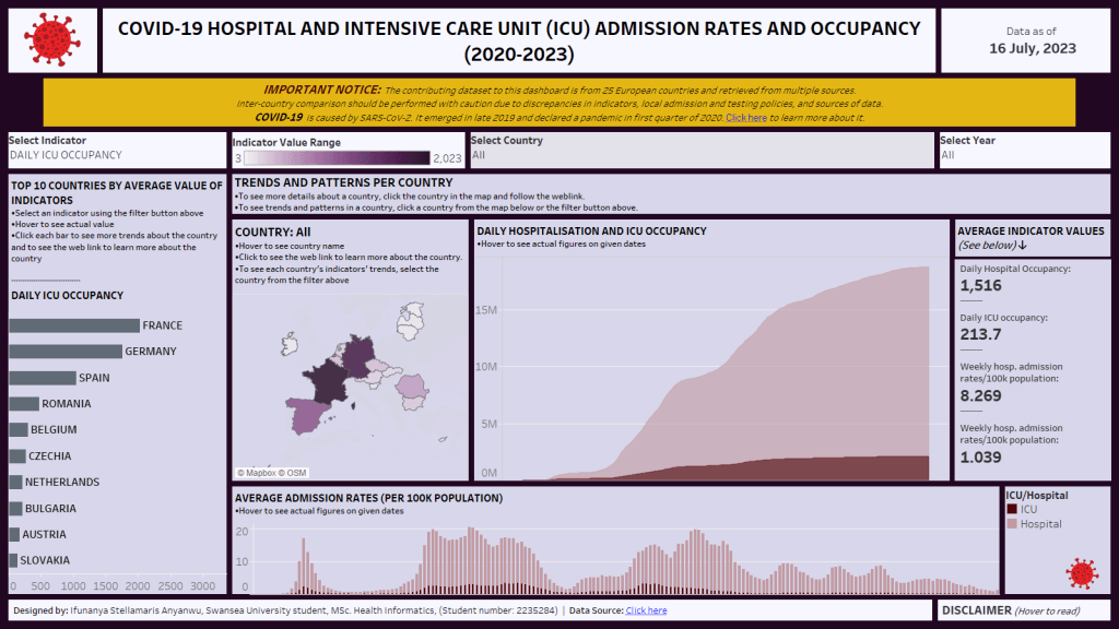
This dashboard was produced as an academic endeavour and the data source behind it is open source. You can interact with the dashboard on my Tableau profile here and see how the patterns change when you select some options.
If you’d like to view this data visualisation blog as a video, then watch the YouTube video below
In this blog, I’ll be walking you through the following:
Table of Contents
THE TASK
This was an assignment for one of my modules during my master’s program. We were required to use Tableau, a data visualisation tool, to produce only one dashboard that analyses a given dataset using visualisations.
In Tableau, there are three major outputs that can be combined in one workbook. The workbook itself is a single Tableau file on a given analysis; see it like the Excel file. Within the workbook, there are now three forms of tabs/outputs which are lined up like the sheets we see in an Excel file.
These three tabs are worksheets, dashboards, and stories. Each worksheet usually contains only one visualisation. Then the dashboard is a collection of multiple sheets and the story is a collection of dashboards. In our assignment, we were not allowed to produce a story, we were limited to produce ONLY one dashboard.
Afterwards, we were to present our output, actions, and insights using Microsoft PowerPoint in no more than 15 minutes, and every aspect of the assignment was to be performed individually.
THE DATA
The link to this data was sent in by my lecturer and you can find it here. Summarily, it was a combined COVID-related data from 25 European countries. And that was the only information given to us in class about the data.
For every data project, one of the first things an analyst does is to understand the dataset. Unless you do this, you’re just wallowing.
Sometimes, clients bring their datasets with all the necessary explanations, other times, you’ve got to do the digging yourself, either by probing the client further or by independent research. Most of my data clients at Novaros Care would have experienced this when I probed them for questionnaires, proposals, objectives, etc.
In this case, I had to do independent research for what is called a data dictionary. In my company, I call it a data code book.
This data dictionary usually bears all the necessary information about every field in a dataset.
It’ll tell you whether height is measured in centimetres or inches. Whether time is based on 12-hrs format or 24-hrs format. And so on. In this case, the data dictionary gave me several insights which later directed the path of my interpretations.
- It told me that the impact of COVID was documented in the dataset using four different metrics.
- It told me that the sources of the various metrics varied across and even within the countries.
- It also told me to be wary of inter-country comparisons for many reasons as highlighted in the picture below.
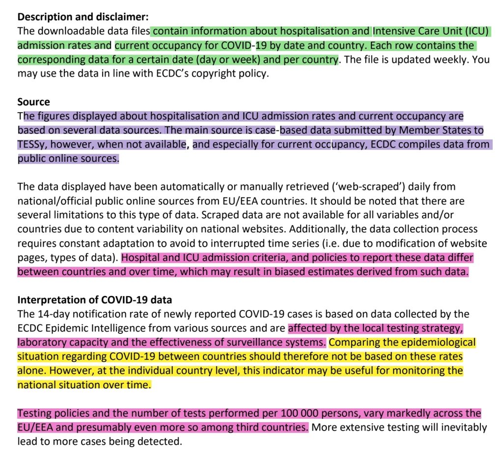
When I was presenting my process to my lecturers, who in this case were like my clients/audiences, I made sure I highlighted these peculiarities because these would be the determinant of decision-making if this were to be real life.
THE PROCESS
First things first, this was the final output of the dashboard at a glance, with no interactions activated.

When I finally grasped the scope of the data at hand, I began wrangling how to make these numbers make sense to an external person who knows nothing about the data.
The first thing I did was to check which metrics each country in the dataset used in reporting their COVID impact. I looked at it using the table below and that showed me that no metric had it all. That meant that whatever I do, I must find a way to depict my visualisations according to each metric and according to each country (remember the limitation warning in the dictionary).
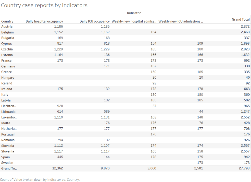
I went to my first workbook and used a bar chart to explore the distribution of countries per metric. In this case, I was actually doing an inter-country comparison but without any decision made out of it. It was just a visual depiction.
To drill it further, I asked my machine to use filter tool and present these according to years just to see some patterns.
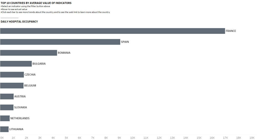
When I was done with that shallow visual depiction, I now delved further to look at each metric.
First, for ease of visualisation, I created four new columns representing each metric, out of the single column housing all the metrics. Now, that made it easier for me to visualise each singular metric without interference, but particularly, it made it easier for the type of chart I desired to create which will feature dual axes.
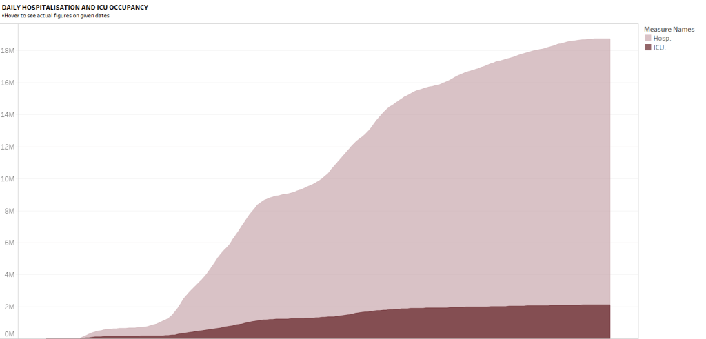
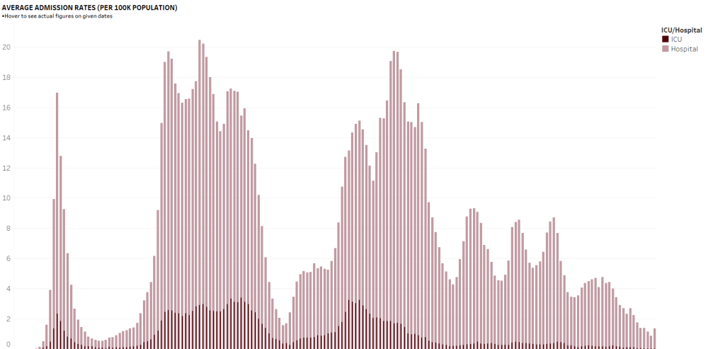
One thing that is important in data visualisation is creativity and space management. In this case, I used dual axes to display two related metrics: so the daily metrics of hospital and ICU admissions were together while the weekly metrics were together.
Also, it required some mathematical knowledge to decide what each chart should represent and why that decision. For the daily metrics, I chose what is called “a running total” which simply cumulates findings from first data point to the last data point.
I chose that running total because it could give me a visual depiction of steep or flattened changes over time.
In contrast, I chose “mean” for the weekly metrics because it would help me create mental patterns at different week points. So, I could see the weeks with low admission rates and those with high rates.
When I was happy with these, I simply used interactive tools to create filter functions where one could just select a particular country and/or year and see what happens to the metrics.
THE AESTHETICS
There are many cars on the road but you’d bet that some cars would pass and you’d turn your neck to take another peek.
Also, I can bet that in school, there were some textbooks you preferred just because of the simplicity of the language and ease of understanding the explained concepts.
These things also happen in data visualisation and sometimes, this is where many analysts get it wrong.
Two analysts can visualise the same data and you’ll understand one output better than the other.
To accommodate many of the technicalities in my analysis, I applied some simple but game-changing rules:

- Tiled & floated containers: In Tableau and Power-BI, each of the combined elements on a given Dashboard is called a container. These containers can accommodate texts, charts, external images, and more. Knowing when to use the tiled and rigid containers versus floaters is important. For example, the COVID icons in my dashboard were all placed as floaters.
- Consistent font choices and colour scheme: it is said that one way to know a newbie in anything that has to do with visual design is overzealousness. In designs, keep it simple and consistent. My titles and subtitles had consistent feelings and didn’t bring distractions to the viewer. The same is built into the colour and where there is a striking colour standout, it was evidently intentional because that was a warning note.
- Instructional titles: even many seasoned analysts are guilty of this one. Some do not put titles, and some put titles and end it there. If you don’t tell your viewers to click the filter tool, they may never know that it exists. The same happens with hovering functions, etc. Hence, explaining why Instructional titles are important.
- White spaces: The bigger the bed size, the sweeter the sleep, I guess, because you’d have enough rotation room. Again, just like consistent colour and font choices, good designers would always ask you to create what is called White space because they make things easy overall.
- Dashboard actions: This dashboard is a classical interactive dashboard which means that what you see at each point changes based on your actions. This dynamic feature was built using Tableau tools called actions like menu, hover, filter, etc. It’s with such a feature that I could fit in more details within the dashboard without struggles. For example, a simple hover at the lower right of the dashboard would show you the full disclaimer.
- Dashboard size: Another intelligent thing to do is to know your audience and where you’re presenting your output. I knew I’d be presenting my output using Microsoft PowerPoint, so it made sense that I used the regular 16:9 orientation over other sizes. That way, it still looked fine on presentation.
- Aliases: I have seen visualisations where the labels were bearing the codes of the column titles like q1, q2, q5, VAR001, VAR09, etc. Some would leave the fields to remain as long as full sentences when we could just use a feature called Aliases, like what I did in this dashboard to depict things clearly.
THE RESULT AND CONCLUSION
If you’ve read this blog up to this point, well done and thank you!
… and welcome to my world.
I wish to also tell you that what I’ve described so far is only but a fraction of every action and decision that went into producing that piece.
But at least, it gave you a glimpse of what happens to data.
I’d also tell you that there were no adept statistical tests that were performed in this analysis.
Some analyses are more statistical than visual, and of course, they’re all important for their purposes.
And some data are numberless but rather the ones we call qualitative data.
Summarily, I’ve just walked you through the scoping process of data visualisation. From the point of getting the data, understanding it and its limitations, wrangling and aesthetically visualising it, and the reality of differing scenarios per data project.
In this case, I scored 90% and I took the bragging right to my chest for a work well done.
In all cases, data is beautiful.
If you want to view the interactive data viz, you can see it here.
Cheers,
STM
